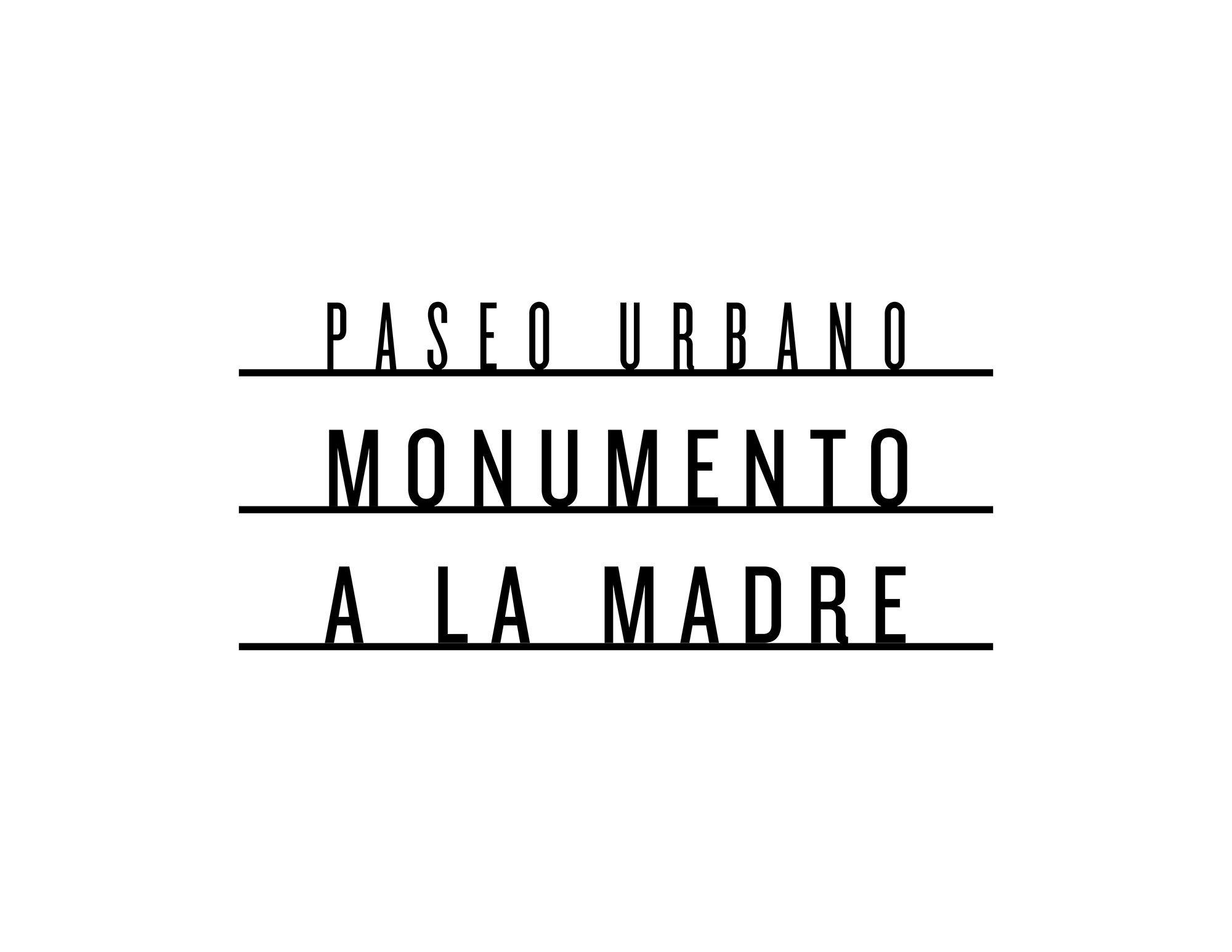
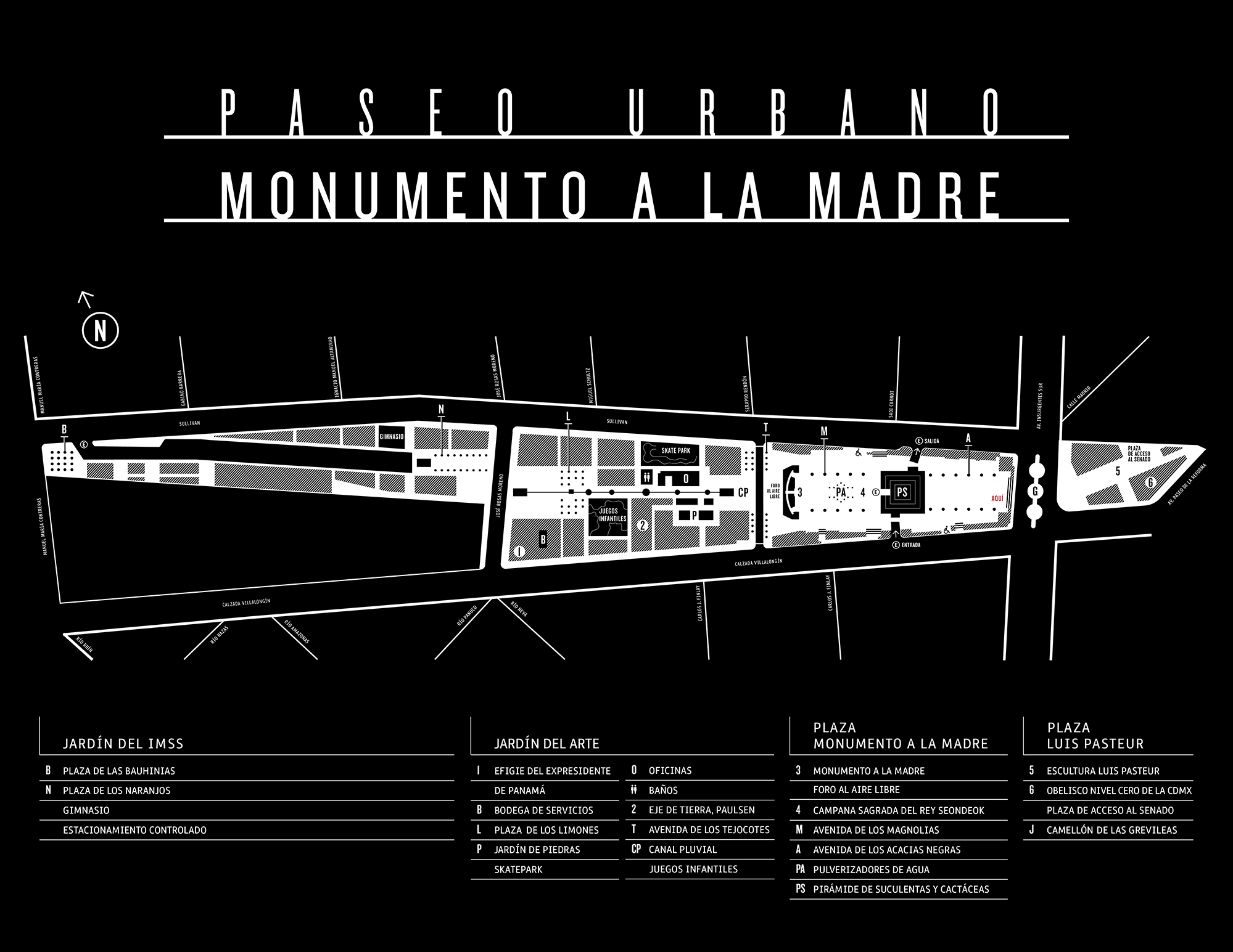
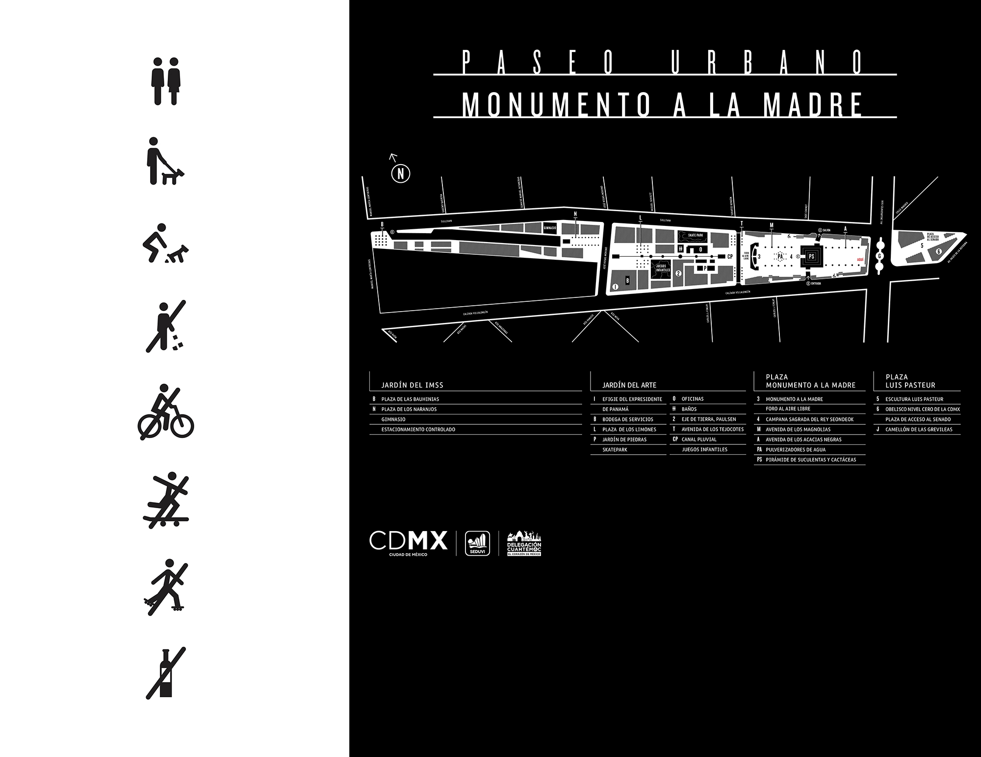
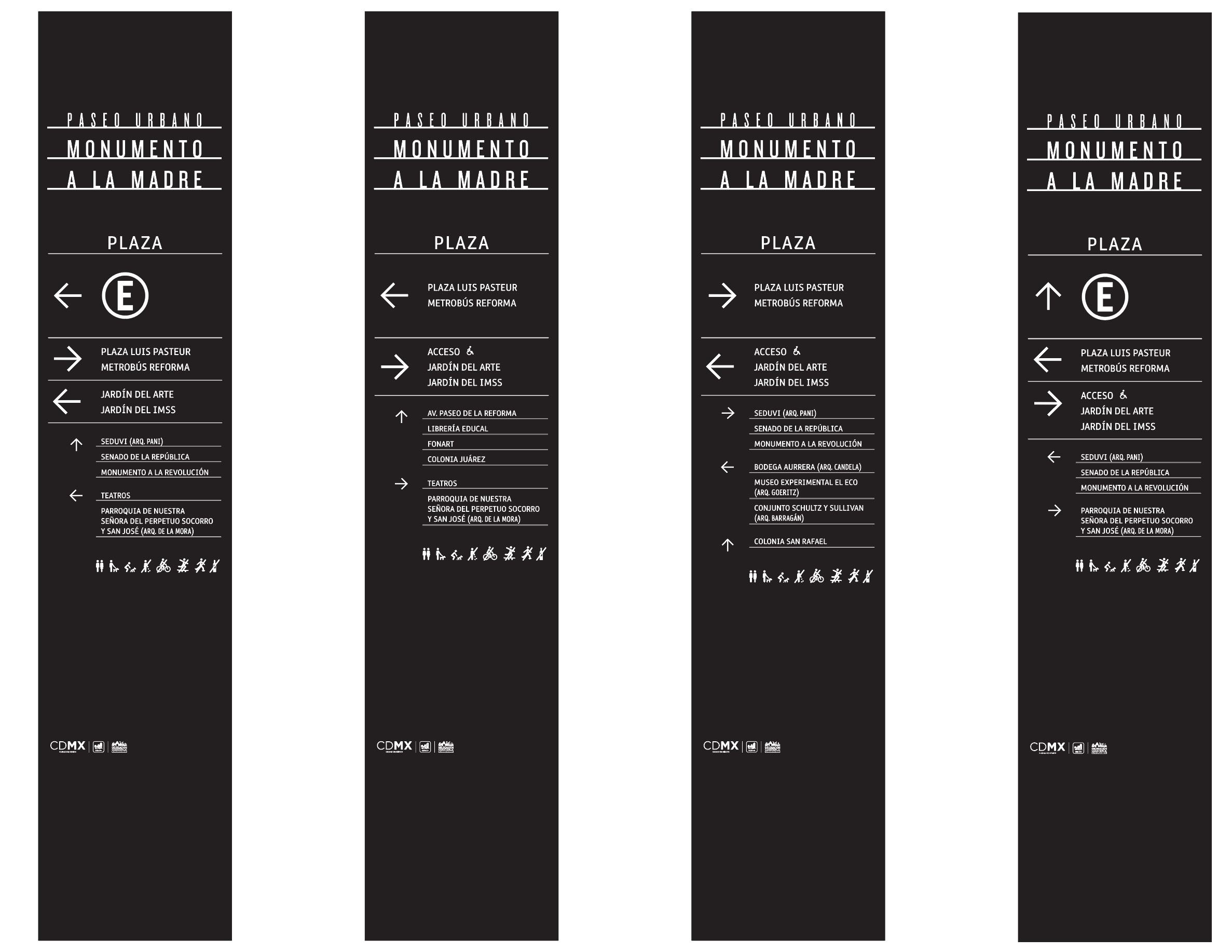
Together with Red Basicolor, we designed the visual identity and signage for the Monumento a la Madre, a public monument restoration project developed by RZero Studio, winners of the CDMX public competition.
The identity design was based on the Art Deco style that predominates in the San Rafael neighborhood and on the way modernist architects placed plaques on façades indicating who had designed and built the house, with signs made of cut steel or other metals.
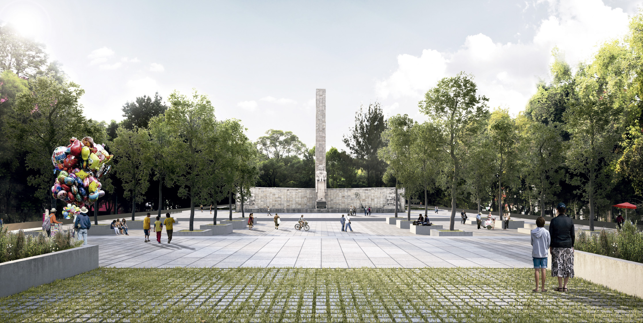
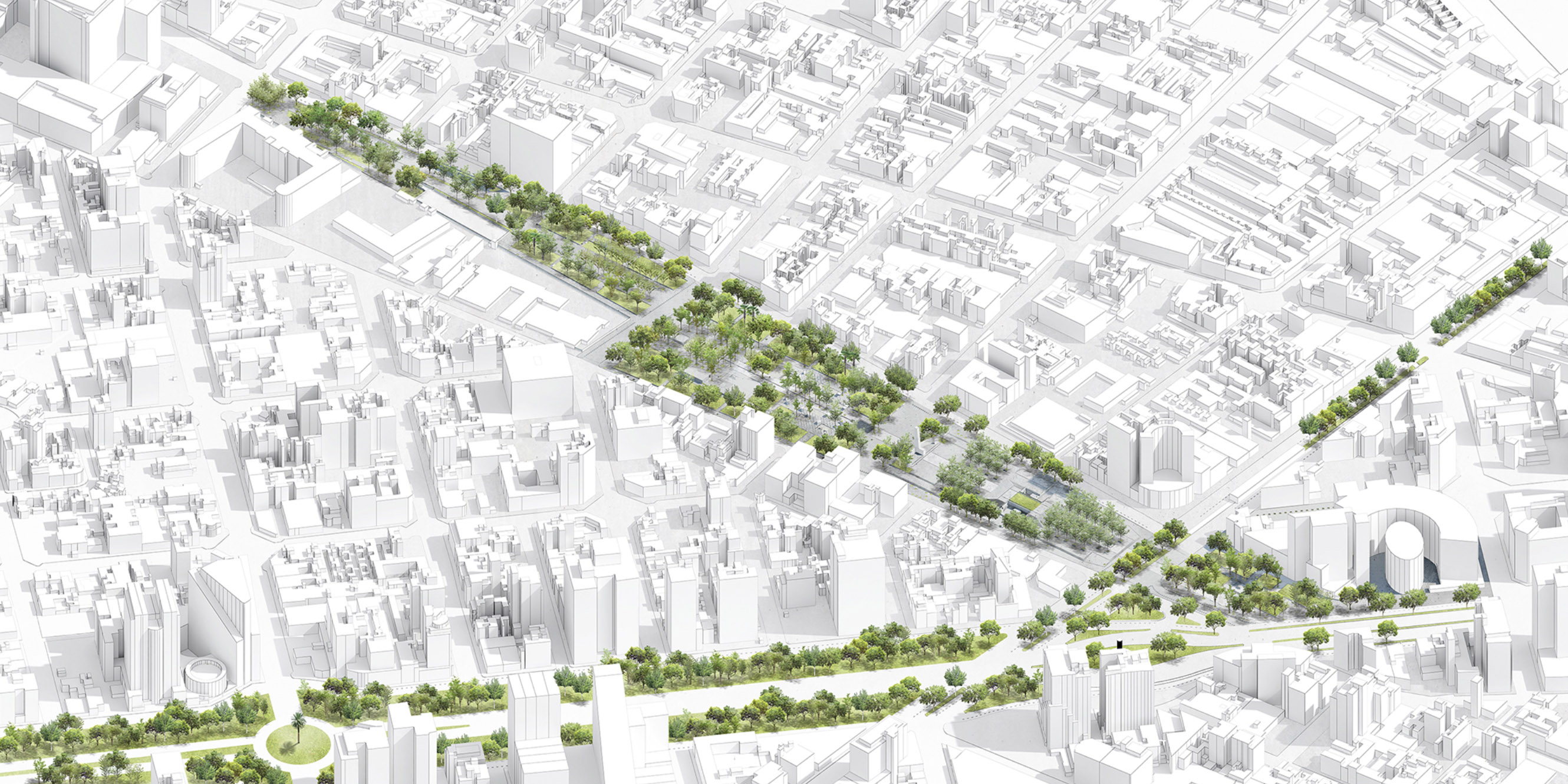
The design was made in black and white to avoid competing with nature and to remain consistent with the architectural and landscape space by Paar Studio.
The signs were produced in Porcewol, a high-quality porcelainized steel that allows for easy maintenance and is ideal for outdoor use.
Monumento a la Madre
Cítrico Gráfico + Red Basicolor
Visual Identity & Signage
Client: Rzero Studio, Abilia, CDMX
Year: 2018